(continued from here)
People I’ve met from Portland have a very ‘special’ way of orienting themselves, which is reflected in both maps that I’ve received from there. While taking for granted that the top of the page meant “North,” my first map has Southeast in the top right corner. Portlanders divide their city into quadrants, with the Willamette River, which runs North to South as the division between East and West, and a centrally located main street (Burnside Ave.) to be the other divider. This is all fine and good, except that I didn’t realize that when they draw maps, they portray the river to run East to West, instead of the direction that it ‘actually’ runs. As a result, for a solid five days I believed I was staying at a friends house in Northwest Portland when really I was in the Southeast. Imagine my disorientation when the sheet was finally pulled from over my head. One person’s explanation involved something about the direction the river runs, and how it would be really nice if it ran East to West, so they just like to pretend it does. My second map was an even better example of this peculiar directional shift. It was drawn on a conventional, store-bought map, yet the author/interpreter has tilted it to the side so that West could be on top, in a mirror reversal of the first map. (Both had the river running E-W, but the first had East on top, and the second, West on top) This is why the printed words “downtown Portland” are shifted a quarter clockwise and the original printed ‘North’ arrow points to the right now.
In comparison to older maps of ancient cities with organic, winding roads that follow natural landmarks, the ‘Portland orientation’ seems to gain some inspiration from the river, not JUST the standard man made grid imposed upon it. Even in my city of Chicago there are remnants of main thoroughfares which outdate the rigid, carefully numbered grid system. These throwbacks are the reason why there are “crooked” streets that veer, for example, northwest/southeast. Contrary to urban myth, they weren’t created to torture us with six-way intersections and the “hard left vs. soft left” dichotomy that still confuses newcomers. Anomaly streets like my neighborhood’s Milwaukee Avenue follow glacial patterns: elements of nature that became footpaths of Potowatamee Indians far before Chicago imposed its grid. However, as we moved from walking to horses to cars, our increase in speed led to less natural, more carefully calculated routes, affecting the way we experience space in many ways. Street layout changed, maps changed, even the standard height of street signs, starting at 10 feet, would eventually rise to 70 feet tall. A personal map will return to the concept of the original footpaths, showing shortcuts and alleyways that only personal experience dictates.
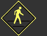
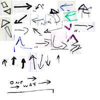
Aside from the compass rose, many other familiar symbols came up a lot in my collection. Originally I predicted that X-es would be the dominant icon to “mark the spot” of personal landmarks, but they actually had heavy competition in the form of boxes, points, arrows, asterisks, stars, even the odd triangle. Many of these symbols aren’t only housed in maps, but exist out in the world as navigational aids as well.
One of the most prominent navigational symbols both in the world and its simulation is the arrow. In standard road signs, from 1950’s neon-infused diners to newer backlit plastic motel signs, the arrow has undergone constant evolution. Motel signs in the early 1950’s included a rudder on the tail end of the arrow, followed by a more expressive wraparound design in the mid-50’s with a more stylized point and no rudder, to an even more abstract version which eliminates all but the arrowhead. As travel and speed increased, the roadside landscape become more and more cluttered with visual instructions and navigational aids, until signs which started off as location-specific, detailed and personal, eventually turned generic, functional and abstract. The standard white, rectangular backlit plastic sign with its modular, uppercase block letters was created to be a respite from the visual clutter of the older, ‘busier’ neon signs of the fifties: signs became less about personality and more about function. We drive past a hodgepodge of these sign designs every day, even if we aren’t mentally registering them as a physical history lesson of travel and navigation through space. While all of it flows into the “background,” these symbols do affect us, and are evident in my maps, which, after all, have been extracted from the map makers’ repertoire of symbols (conscious or not) which guides the pen to make all sorts of marks.
Asterisks, sputniks, stars; these also show up prominently both in signs and my maps. Thatched railroad tracks and squiggly lines denoting rivers seem to play their own major part in common navigational guidelines, but some of these patterns also have to do with where I’ve travelled and acquired these maps. Only two of my maps contain mountains, but this would surely be different if I conducted the same project from a home base in the West Coast as opposed to the Midwest. Here lies the quality of my collection as an extended portrait of my own personal space.
I do feel it necessary to add, though, that in addition to the commonalities listed above, I’ve found equally as many completely unique and lovely small illustrations, some ambitious map makers even ditching 2-D and using perspective! Beside the points and boxes we have donut shops; a confused truck with a question mark over its head; rad girls on bikes; abandoned shrines; the list goes on and on.
Module III: “If you cross the tracks you’ve gone too far!”
I’ve noticed that my map collection can be divided into two large subcategories to describe their function: Category One could be called “If you cross the tracks you’ve gone too far - maps that tell directions.” Category Two could be called “...and this is where I crashed my bike – maps that tell stories” The first kind sends the receiver on a journey towards a new story of some kind, the second teaches of stories that have already happened.
(article continued here)